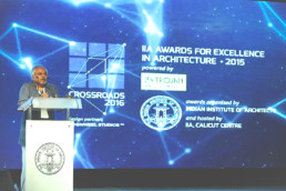
Crossroads is a biyearly confluence of Architects coming together to celebrate the spirit of Architecture in India. This edition of Crossroads came with an objective of transforming the experience of the well-received IIA National Awards 2015 into a nurturing experience for the award recipients as well as others taking part in various knowledge driven sessions of the three-day event.
Since the event scaled across three days and attracted a noticeable participation fee, our problem statement was to effectively position the event brand, develop intriguing communication tools that could attract the target users into the event at a time where the target audience had various avenues to venture.
ClientIndian Institute of Architects (IIA) - Calicut CentreServicesBrand Strategy and Positioning, Identity system, UX and UI Design, Go-To market tools, Communication Design, Motion Graphic Design, Industrial Product Design Year2016Linkhttp://www.atcrossroads.in
Brand Strategy and Positioning
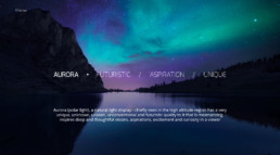
In order to drive the well-appreciated process of interacting with the ongoing IIA National Awards platform, we intervened to understand the cognitive ability of the target audience group and strategized a design direction that embraced a brand story which can spark attention and effectively connect with the target audience group.
Identity Systems
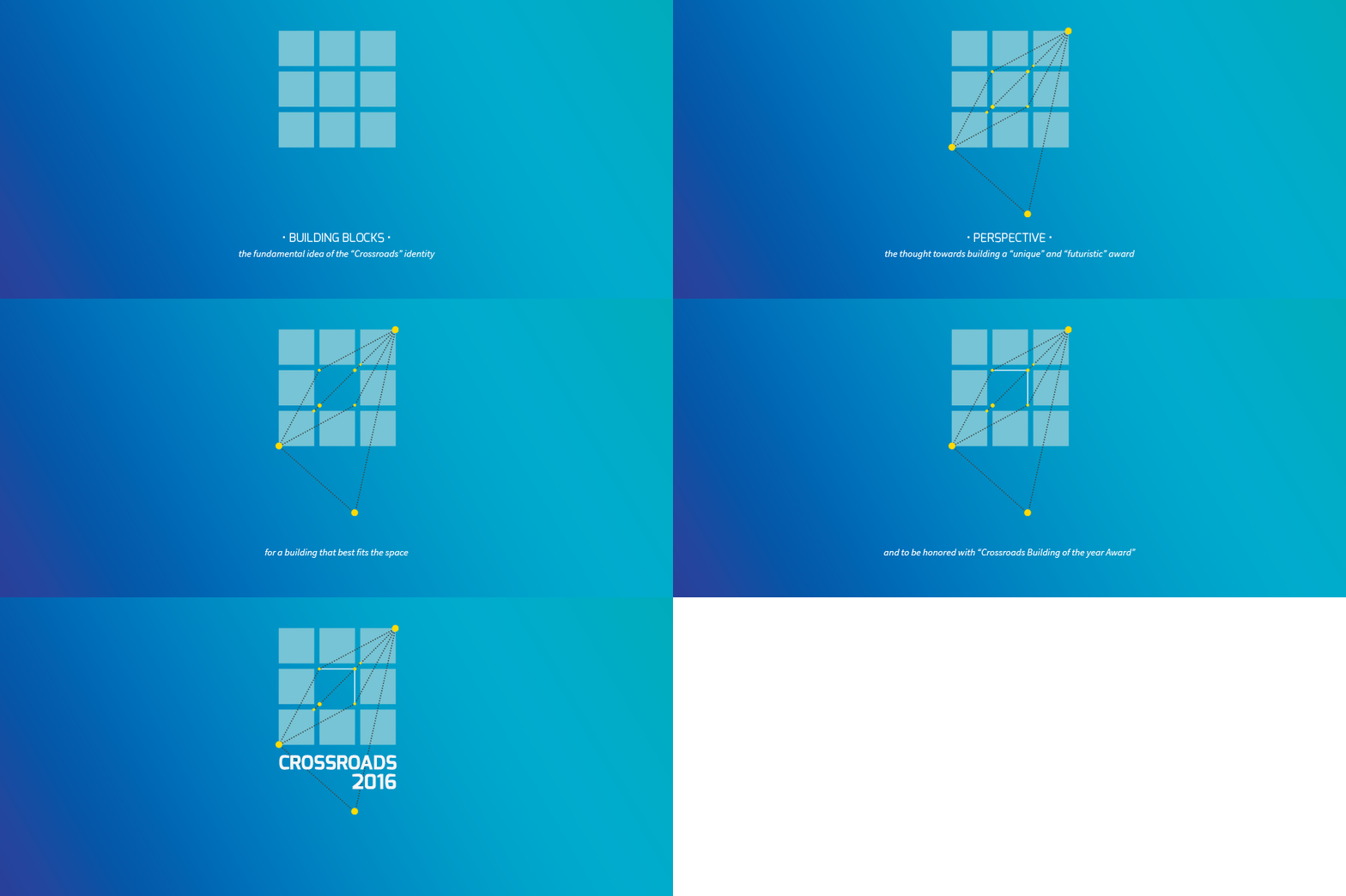
Drawing motifs from the set strategic design directions, and banking on the reminiscence of the earlier edition of Crossroads visual identity, we further intervened to conceptualize and develop an element of strong reference - Cornerstone, as the tangible element for the target audience to resonate around the event brand identity system.
Narrowing down from a large intangible design direction to a more tangible element also helped in building a strong cognitive relation in the user's mind with the brand identity systems.
UX and UI Design
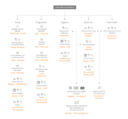
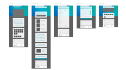
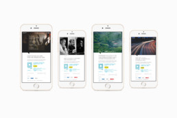
With a strong design strategy and a visual identity system in place, the design team understood the need for building a web-based, brand interaction tool to facilitate the target audience group to interact, connect and register for the event.
The designed tool was primarily conceived to be adaptive across the cross-browser platform and enabled the target audience to precisely navigate across the same without needless diversions. The web tool also largely embraced the conceived design direction and provided a unique opportunity for the audience to understand the visual motif in order to build a holistic brand experience.
Communication Design
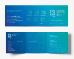
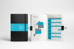
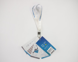
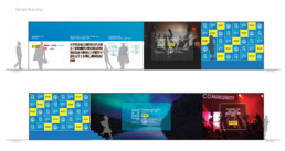
To communicate the idea of design intervention so far with the event platform and to further embrace the conceived design strategy, we designed and developed clean, legible, and visually enriching communication systems scaling across various mediums as identified by the marketing team.
Industrial Design
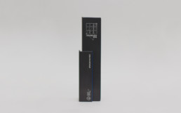
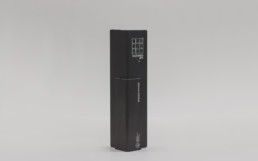
In order to facilitate a brand recall experience, and as a giveaway memento for brand sponsors, volunteers, and special mentions, we further intervened to design and craft the cross-section of the event brand identity in an aluminum extruded profile, sandwiched with the visual motif of the present edition to set forth a holistic brand experience.
Motion Graphic Design
As a filler element during breaks, changeover sessions of the three-day event celebration, we conceptualized, designed and produced a motion graphic video that explained the key features of the event along with the novelty behind the overall experience of the event.
Impact
In anticipation to attract registrations from all over India, the organizers were skeptical with the move of planning and organizing an event with a paid entry.
With our meticulous intervention of building and positioning the brand, digital interaction systems, marketing tools and overlooking many more areas of the event with our underlying specialization in "design-thinking", the organizers were able to successfully attract and sell all paid registrations in record time. Post the event, the established overall user experience set a new benchmark in the domain of conducting architectural events in India.
